SaaS Pricing Pages That Convert: Anatomy of a Winning Page
What makes a SaaS pricing page convert: the anatomy of a winning page, five real teardowns, and the pricing psychology behind three tiers and a middle plan.
· Justin Boggs

Photo by Angèle Kamp on Unsplash
A SaaS pricing page converts when it answers three questions in the first few seconds: which plan is right for me, is this worth the money, and what happens when I click the button. Everything on a high-converting pricing page serves one of those three questions, and everything that doesn't is noise that lowers your conversion rate. The pages that win aren't the prettiest or the most feature-stuffed — they're the ones that make the decision easy: a small number of clear tiers, an obvious recommended plan, transparent prices, and a single unmistakable action per tier. This post breaks down that anatomy, the psychology underneath it, and five real pages worth stealing from.
TL;DR
- A pricing page is a decision aid, not a price list. Its job is to help someone choose a plan, believe it's worth it, and know what the button does.
- Three to four tiers, one obviously recommended. The middle plan wins because of anchoring and the center-stage effect — design for that on purpose.
- Show the price. Hiding it behind a "contact sales" or a demo call leaks conversions; transparency is the single easiest win.
- One clear action per tier. A feature comparison table below the tiers lets buyers justify the choice; fake urgency and tier soup kill trust.
- Test it forever. A pricing page is a conversion engine, not a set-and-forget asset.
What a pricing page is actually for
Most founders treat the pricing page as a spreadsheet to publish: here are the plans, here are the prices, done. That framing is why so many pricing pages underperform. The page isn't a table of facts — it's the highest-intent moment in your funnel, where someone who's genuinely considering paying you decides whether to click.
A SaaS pricing page is a decision aid, not a price list. Its entire job is to move a specific person from "interested" to "I'll take that one." That means it has to do three things fast: help them self-select the right plan, convince them the plan is worth the price, and make the next step obvious. If any of the three is unclear, they stall — and a stalled buyer on a pricing page almost never comes back later to finish.
This reframing changes what you optimize. You stop asking "did I list all the features?" and start asking "can a stranger pick their plan in ten seconds?" You stop showing off the depth of your product and start reducing the cognitive work of choosing. The best pricing pages feel almost too simple, because simplicity is the feature — every element that doesn't help someone decide is quietly working against the decision.
It also changes how you think about the audience. A pricing page is often read by more than one person: the user who wants the tool and the manager or finance person who has to approve it. That's why a clear comparison table matters — it lets the champion justify the choice to someone who was never on your site. Design for the decision and the internal sell, and you've covered the two real jobs the page has to do. Get your underlying pricing strategy right first, then let the page do the narrower job of making that strategy easy to say yes to.
The anatomy of a page that converts
Strip a high-converting pricing page down and you find the same handful of components, arranged to answer those three questions in order. Here's the parts list.
A small number of tiers — usually three, sometimes four. Too few and you can't segment buyers; too many and you cause decision paralysis. Three is the workhorse because it gives you a cheap anchor, a recommended middle, and a premium ceiling. If you offer four, the fourth is usually an enterprise "contact us" tier, not a real self-serve option.
A one-line "best for" under each plan. "For solo founders," "For growing teams," "For companies that need SSO." This single line does more self-selection work than the entire feature list, because it tells people which bucket they're in before they read a word of detail.
A visible, recommended plan. One tier should be visually lifted — a "Most popular" ribbon, a border, a slight elevation. This isn't decoration; it's guidance, and the psychology section below explains why it works so reliably.
Transparent prices. Show the actual number. Stripe's guidance on SaaS billing puts it bluntly: if someone needs a sales call just to understand your pricing, it's probably too complicated. For self-serve SaaS, gating the price behind a demo is the most common self-inflicted conversion wound.
A billing toggle (monthly/annual). Let people choose how they pay and show the annual discount inline. It gives price-sensitive buyers a cheaper monthly number and gives you more up-front cash and lower churn from the ones who pick annual. The mechanics of that trade are worth understanding — I unpack them in subscription billing math.
One clear CTA per tier. Each plan gets exactly one button, and the buttons should be near-identical in wording ("Start free," "Choose Pro"). Competing calls to action within a tier split attention and lower clicks.
A feature comparison table below the tiers. Put the headline differences in the cards, then a full comparison table underneath for people who want to verify. The table is also the most extractable part of the page for search and AI answer engines, and it's what a buyer forwards to their finance team. Keep the summary cards skimmable and let the table carry the detail.
The psychology: three tiers, anchoring, and the middle plan
The reason three tiers with a highlighted middle works isn't a design fad — it's two well-documented cognitive effects doing predictable work. Understand them and you'll design pricing pages on purpose instead of by imitation.
The first is anchoring. People judge a price relative to whatever number they saw first, not in absolute terms. As Nielsen Norman Group explains, a good anchor sets expectations for what's normal or expensive and can even raise the perceived value of what you're selling. A visible high tier makes the middle tier feel reasonable; a struck-through "was" price makes the current one feel like a deal. Without an anchor, your price is just a number floating in space with nothing to look good against.
The second is the center-stage effect (a cousin of the compromise effect): when options sit side by side, people gravitate to the middle. Put your cheapest plan on the left, your premium on the right, and the plan you actually want people to buy in the center — highlighted — and you've stacked the layout in favor of the outcome you want.
The most striking demonstration of how far this goes is Dan Ariely's Economist subscription experiment. Readers were shown three options: web-only at $59, print-only at $125, and print-plus-web also at $125. The print-only option looks pointless — why would anyone pay the same for less? But it wasn't there to be chosen. It was there to make the bundle look brilliant.
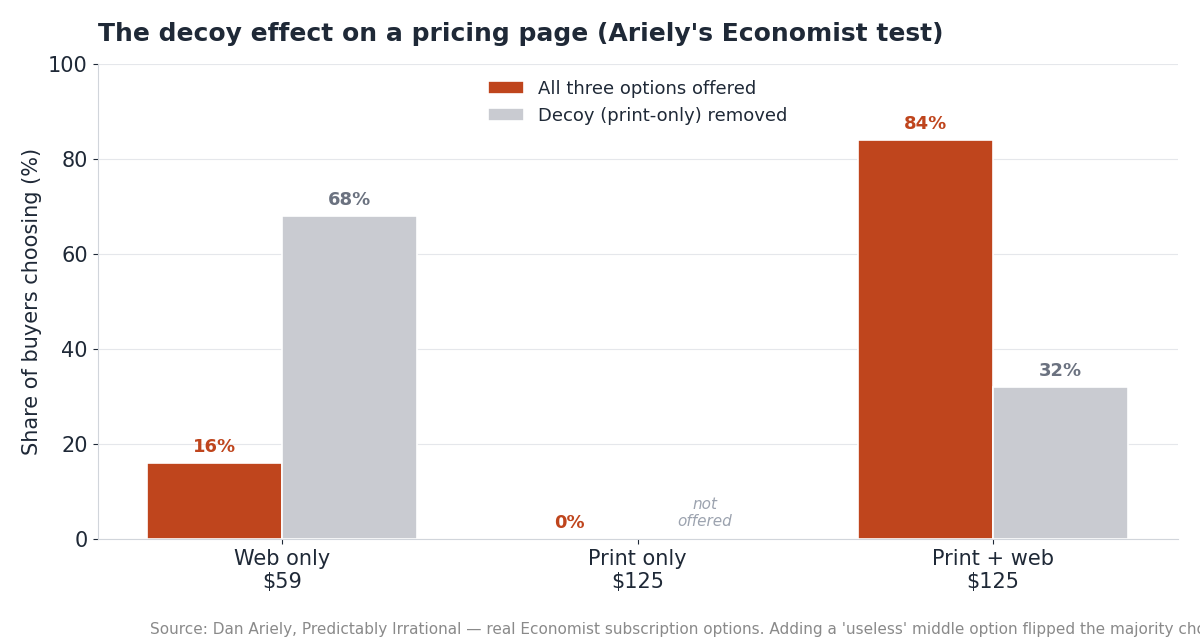
The results are the whole lesson. With the "useless" middle option present, 84% chose the expensive bundle and only 16% took web-only. Remove the decoy, and the majority flips — 68% now choose web-only and just 32% take the bundle. Nothing about the two real options changed. The mere presence of a third, worse option moved the majority of buyers to spend more.
You don't need to run a manipulative decoy to use this. The honest version is simply: give people a clear reference point and a recommended middle, and arrange the layout so the plan you'd genuinely recommend is the easy default. That's not a trick — it's removing the friction from a choice people already want to make. The line you don't cross is offering plans designed purely to mislead; the line you should walk is making your best-value plan obviously the best value.
Five real pricing pages and what each gets right
Theory is cheap. Here are five real pages, each nailing one pattern worth copying. I'm describing the structure rather than quoting exact prices, because prices change and the structure is the durable lesson.
Basecamp — radical flat simplicity. Basecamp is famous for refusing the per-seat model. Instead of pricing that scales with headcount, it offers a flat plan where everyone on your team is included. The lesson: per-seat pricing isn't a law of nature. A single, flat, easy-to-predict number can be a positioning statement in a category where everyone else makes you do headcount math.
Stripe — transparency as the product. Stripe puts its price right on the page — the well-known 2.9% + 30¢ per successful card charge — with no "contact sales" wall for standard usage. For a usage-based product, that transparency is the conversion strategy: buyers can estimate their bill from information they already have, which is exactly what Stripe's own billing guidance recommends.
Linear — restraint and clarity. Linear's page is minimal: a short set of clean tiers, a clear recommended plan, and no visual clutter. It trusts its developer audience to read quickly and get out of their way. The lesson: for a focused audience, less explanation converts better than more.
Notion — free tier as the front door. Notion leads with a genuinely useful free plan, then scales per seat as teams grow. The free tier is the acquisition engine; the paid tiers monetize the teams that stick. If you're weighing this model, the tradeoffs are exactly the ones in free trial vs freemium vs paid — a free tier is a customer-acquisition cost, not a giveaway.
Coding Capybaras — one-time, honestly caveated. Our own pricing page breaks the SaaS convention entirely: the boilerplate is free, and Pro is a one-time $97 rather than a subscription. That's deliberate, and it has real tradeoffs I'm upfront about — one-time pricing means no recurring revenue to smooth the business, which is a genuine cost I accept in exchange for a price non-technical founders don't have to think about monthly. The lesson isn't "copy our price." It's that the shape of your pricing is itself a positioning decision, and being honest about its tradeoffs builds more trust than pretending there aren't any.
Here's the pattern each page nails, in one view:
| Page | Pattern it nails | The lesson to steal | | --- | --- | --- | | Basecamp | Flat, non-per-seat pricing | Predictable beats "scales with headcount" | | Stripe | Price shown openly on the page | Transparency is a conversion strategy | | Linear | Minimal, clean tiers | For a focused audience, less converts more | | Notion | Generous free tier as acquisition | A free plan is a channel, not a cost center | | Coding Capybaras | One-time price, honest tradeoffs | Pricing shape is positioning |
Common mistakes that leak conversions
The fastest way to improve a pricing page is often to remove what's hurting it. These are the leaks I see most, roughly in order of how much they cost.
Hiding the price behind a demo. For self-serve SaaS, "contact us for pricing" on every tier is the biggest own-goal. It adds a step, signals the product is expensive, and filters out exactly the self-serve buyers who'd have converted without a sales call. Enterprise tiers can gate pricing; your core plans shouldn't.
Too many tiers. Five or six plans feel generous to the founder and paralyzing to the buyer. Every extra option adds decision cost. Collapse toward three, and push the edge cases into a single "contact us" tier.
Feature-list soup. A wall of forty checkmarks per plan doesn't reassure people — it exhausts them. Put three to five differentiating features in the cards, and move the exhaustive list into the comparison table below for the minority who want it.
No annual option. Leaving out an annual toggle costs you both the price-sensitive buyer (who wanted the lower effective monthly rate) and the cash-flow and retention benefits an annual commitment brings. It's a rare element that helps both sides.
Fake urgency. Countdown timers and "3 seats left!" on a SaaS pricing page read as manipulation to a modern buyer, and manipulation is expensive on the one page where trust matters most. If a discount is real and time-boxed, say so plainly; if it isn't, don't fake it.
Treating it as finished. The single biggest mistake is shipping a pricing page once and never touching it again. Pricing is the highest-leverage number in your business, and small wording, layout, and packaging changes move it. Revisit it as your product and audience change, and watch what happens to conversion — and to churn, since the wrong plan structure pushes people into plans they'll cancel. Your pricing page and your onboarding flow are the two surfaces most worth iterating on, because both sit right on the revenue.
Frequently asked questions
How many pricing tiers should a SaaS have?
Three is the common default, and four when the fourth is an enterprise "contact us" tier. Three gives you a low anchor, a recommended middle, and a premium ceiling without overwhelming the buyer. More than four tends to cause decision paralysis and lowers conversion.
Should I show prices or hide them behind "contact sales"?
Show them, for any self-serve plan. Hiding prices adds friction, signals expense, and filters out the exact buyers who'd convert without a sales call. Reserve gated, "contact us" pricing for genuine enterprise tiers where the deal is negotiated anyway.
Why do highlighted middle plans convert better?
Two effects: anchoring, where a visible higher tier makes the middle feel reasonable, and the center-stage effect, where people naturally gravitate to the middle option when plans sit side by side. Highlighting the middle tier and placing it centrally aligns the layout with how people already choose.
Do I need a monthly/annual billing toggle?
It helps almost every SaaS. A toggle gives price-sensitive buyers a lower monthly number and gives you more up-front cash and lower churn from customers who commit annually. Show the annual discount inline so the tradeoff is obvious.
Is a decoy plan manipulative?
It can be, and the line is intent. Ariely's Economist experiment shows how powerfully a "useless" option shifts choices, but the honest version is simply giving buyers a clear reference point and an obviously best-value middle plan. Offering plans designed purely to mislead crosses the line; making your best plan clearly the best value does not.
How often should I update my pricing page?
Treat it as a living conversion surface, not a set-and-forget asset. Revisit it whenever your product, audience, or costs change, and test wording, layout, and packaging regularly. Pricing is the highest-leverage number in the business, so small improvements compound.
The bottom line
A SaaS pricing page converts when it makes a decision easy: a few clear tiers, an obvious recommended plan, transparent prices, one action per tier, and a comparison table for the people who need to justify the choice. The psychology — anchoring and the center-stage effect — isn't a trick to bolt on; it's the reason clean, well-arranged pages work, so design for it honestly. Then keep iterating, because pricing is the one number where small changes move the whole business.
If you're building a SaaS with AI coding tools and want a working example to study, Coding Capybaras ships with a real, configurable pricing page in the codebase — free to download, so you can see exactly how the tiers, toggle, and checkout fit together before you write your own.