React UI Component Library Comparison: shadcn, Radix, MUI
A non-tech founder's guide to choosing a React UI component library in 2026 — shadcn/ui, Radix, MUI, or none — weighing ownership, accessibility, and AI-coding fit.
· Justin Boggs
Photo by Dharmik Moradiya on Unsplash
If you're a non-technical founder shipping a SaaS with AI coding tools, the best React UI component library in 2026 is shadcn/ui for most projects — because it copies component source code into your repo instead of hiding it behind an npm dependency, and that ownership model is exactly what AI assistants like Claude Code work best with. Radix UI is the right pick when you want raw accessible behavior with zero styling opinions. MUI is the safer choice when you need dozens of complex components — data grids, date pickers, charts — on day one. This post explains how to decide, in plain terms, without pretending there's one answer for everyone.
TL;DR
- shadcn/ui copies component code into your project — you own it, AI tools can read and edit it, and there's no black-box dependency. Best default for AI-assisted SaaS builds.
- Radix UI gives you accessible behavior (focus, keyboard, ARIA) with no styling. It's the layer shadcn is built on. Pick it if you want total design control.
- MUI ships 50+ production components including the hard ones. Pick it when speed on complex UI beats ownership.
- The real question isn't "which is best" — it's "which do I want to own, and which does my AI assistant handle well."
What a UI component library actually is
A React UI component library is a pre-built set of interface elements — buttons, dropdowns, dialogs, tables — so you don't have to build each one from scratch. That's the whole pitch. A login form needs an input, a button, maybe a checkbox. A pricing page needs cards and a toggle. A dashboard needs tables, tabs, and menus. Someone already solved these problems well; a component library lets you reuse that work.
The catch is that "reuse" comes in two very different shapes, and the shape matters more than the specific library. A styled library like MUI hands you finished, good-looking components you configure through props. A headless library like Radix hands you the behavior — the tricky accessibility and keyboard logic — and expects you to supply the styling. shadcn/ui is a third thing: it copies styled components built on headless primitives directly into your codebase.
For a non-technical founder, the distinction sounds academic until your first customization request. You want the button's hover color changed, or the dialog to close differently, or a new size variant. With a styled black-box library, you can only change what the library's API allows. With owned code, you change the file. That single difference — can I edit the actual component, or only its settings — is the fork in the road this whole decision hinges on.
I lean toward owning the code, and I'll explain why below. But this is a genuine tradeoff, not a slam dunk. If you're weighing the broader "should I assemble pieces or buy a finished thing" question, I wrote a whole post on build vs. buy for SaaS components that applies here too.
shadcn/ui: you own the code
shadcn/ui broke the standard model. Every other React UI project ships through npm — you install a package, import components, and the source lives in node_modules where you never touch it. shadcn/ui does the opposite. You run a command like npx shadcn@latest add button, and it drops a button.tsx file straight into your project. As Vercel's own shadcn/ui course puts it, "Traditional libraries create dependency relationships. shadcn/ui creates ownership relationships."
That ownership is the reason shadcn/ui became the default for AI-assisted development. When Claude Code or Cursor works on your project, it can read the actual button component, understand every line, and edit it directly. There's no library API to reverse-engineer, no black box to reason around. The AI sees the same code you do. If you've read my post on why AI coding tools changed what non-devs can ship, this is the concrete version of that shift — the tool and the code speak the same language.
The tradeoffs are real and worth stating plainly. You take on maintenance: npm update won't touch the copied files, so pulling upstream improvements is a manual decision your team makes. The starting catalog is smaller than MUI's — there's no packaged data grid or date picker waiting for you. And you're now responsible for the code, which means "blame the library" stops being an option.
There's also a 2026 wrinkle worth knowing. MUI released Base UI as a standalone headless primitive library, and shadcn/ui now supports Base UI primitives alongside its original Radix foundation. In practice that means when you add a shadcn component, you can choose whether it sits on Radix (the long-standing default) or Base UI (newer, actively staffed). You don't have to decide this on day one, but it's a sign the ecosystem is maturing rather than fragmenting.
Coding Capybaras uses shadcn/ui for exactly these reasons — the components live in the codebase you download, so your AI assistant can work with them and you can change anything. Every UI element on this site is code you'd own.
Radix UI: behavior without opinions
Radix UI sits one layer beneath shadcn. It's a headless library: it provides the hard, invisible parts of a component — focus management, keyboard navigation, ARIA roles and states — and provides no styling at all. You get a dropdown that behaves correctly for a screen reader user and supports arrow-key navigation, and you make it look however you want.
Accessibility is where Radix earns its reputation, and this isn't marketing fluff. Per Radix's official documentation, the primitives "follow the WAI-ARIA authoring practices guidelines" and are "tested in a wide selection of modern browsers and commonly used assistive technologies." Radix handles the aria and role attributes, focus management, and keyboard behavior that most hand-rolled components get subtly wrong. Its components are tested against NVDA, JAWS, and VoiceOver — the screen readers real people use.
For a founder, the honest read is: you probably won't use Radix directly, but you're using it anyway. Because shadcn/ui is built on Radix primitives, choosing shadcn means you inherit Radix's accessibility for free. You'd reach for Radix on its own only if you want to design every pixel from scratch and skip shadcn's styling conventions entirely — a reasonable choice for a design-led team, overkill for most first launches.
One caveat Radix states clearly: it handles the mechanical accessibility, but you're still responsible for accessible content, labels, and color contrast. A perfectly-coded dropdown with unreadable gray-on-gray text still fails real users. Tools handle the plumbing; judgment is still yours.
MUI: the batteries-included option
MUI (formerly Material UI) remains the most downloaded React component library in 2026, and it earns that by shipping the components nobody wants to build. A styled library gives you everything pre-built, and MUI's "everything" includes over 50 production-ready components — data grids, date pickers, charts, autocomplete — that would take weeks to assemble from primitives.
That's the case for MUI in one sentence: if your product is data-heavy on day one, MUI saves you real time. A B2B admin tool with sortable, filterable, paginated tables is painful to build from scratch. MUI hands you a data grid that works. For that class of product, the time saved can outweigh the ownership you give up.
The cost is the black box. You customize MUI through its theming system and props, not by editing component source. When you need something the API doesn't expose, you're back to fighting the library — overriding styles, wrestling with CSS specificity, or accepting the default. For AI-assisted workflows, this matters more than it used to: an AI assistant can configure MUI's props, but it can't read and rewrite a component it doesn't have the source for. The black box is a black box to your AI too.
MUI also brings a heavier runtime and a distinctive Material Design look that takes effort to escape. If your brand is meant to look nothing like Google, you'll spend time un-Google-ing it. None of this makes MUI wrong — it makes it a specific tool for a specific job. I'm generally a fan of boring, proven technology, and MUI qualifies. It's just optimized for a different priority than ownership.
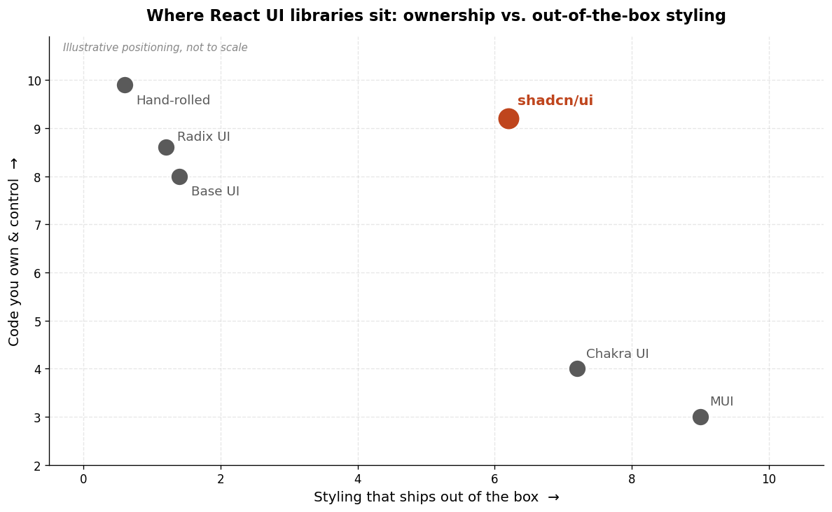
The comparison, side by side
Here's the decision compressed into one table. Read the "AI-coding fit" and "You own the code" rows first — for the audience this blog is written for, those two matter most.
| Factor | shadcn/ui | Radix UI | MUI | None (hand-rolled) | | --- | --- | --- | --- | --- | | Distribution | Copied into your repo | npm dependency | npm dependency | N/A — you write it | | You own the code | Yes | Behavior only | No (black box) | Yes | | Styling included | Yes (Tailwind) | No | Yes (Material) | No | | Accessibility built in | Yes (via Radix/Base UI) | Yes (industry-leading) | Yes | You're on your own | | Components on day one | Growing catalog | Primitives only | 50+ incl. complex | Zero | | AI-coding fit | Excellent | Good | Limited | Depends | | Best for | AI-assisted SaaS builds | Design-led teams | Data-heavy apps | Rarely worth it |
The "none" column deserves a word. Hand-rolling every component sounds like maximum control, but you're re-solving accessibility and keyboard behavior that Radix already solved and tested against three screen readers. For a founder trying to ship, that's the worst trade on the board: maximum work, maximum risk of subtle bugs, no offsetting benefit. The only time it makes sense is a genuinely novel interface that no library models — and even then, you'd build it on top of a headless primitive, not from nothing.
How to actually decide
Strip away the tribalism and the decision comes down to three questions.
First: do you want to own the component code? If you're building with AI coding tools — the whole premise of this site — the answer is almost always yes, because owned code is code your AI assistant can read and edit. That points to shadcn/ui. The ownership model and the AI-assisted model reinforce each other; picking a black-box library fights the way you actually build.
Second: how much complex UI do you need on day one? If your MVP is forms, a dashboard, and a settings page, shadcn's catalog covers you and you'll build the rest as you go. If you need enterprise data grids and date pickers immediately, MUI's head start is worth serious consideration even at the cost of ownership. Be honest about "need" versus "want" — most first launches need far less than founders assume.
Third: who's maintaining this in six months? With shadcn you own the code and control when to pull updates. With MUI you get automatic updates but less control. There's no universally right answer, but for a solo or small team shipping fast, "I can change any component instantly" tends to beat "updates arrive automatically but I can't customize deeply."
There's a practical fourth angle that's easy to miss: how the library behaves inside your AI workflow day to day. When a component's source lives in your repo, you can point Claude Code or Cursor at the exact file and say "add a loading state to this button" — and the AI edits real code you can review. When the component is a black box in node_modules, the AI can only guess at the library's API, and its guesses are only as good as its training data on that specific version. Over a hundred small UI tweaks, that difference compounds into hours saved or lost. This is the quiet reason owned-code libraries have become the AI-era default, and it's worth weighing as heavily as the feature checklist.
My take, stated as a take and not a law: for a non-technical founder shipping a SaaS with AI tools, shadcn/ui is the default, MUI is the exception for data-heavy products, Radix is what you're standing on either way, and hand-rolling is a trap. Whatever you choose, don't spend a week agonizing — this is reversible, and the compounding cost is deliberation, not the wrong pick. The same principle applies to the broader boilerplate decision: pick a sensible default and start shipping.
Frequently asked questions
Is shadcn/ui free?
Yes. shadcn/ui is open source and free to use. Because it copies source code into your project rather than installing a package, there's nothing to license — the components become part of your codebase. Radix UI and MUI's core are also free and open source; MUI sells paid tiers (MUI X) for advanced components like the premium data grid.
Do I need to know Tailwind CSS to use shadcn/ui?
Not deeply, but it helps. shadcn/ui components are styled with Tailwind, so editing them means touching Tailwind utility classes. The good news for non-devs: this is exactly the kind of change AI coding tools handle well. You can describe the change you want ("make this button larger and use our brand orange") and let Claude Code or Cursor edit the class names in the owned component file.
Can I mix libraries — use shadcn and MUI together?
Technically yes, but be careful. Running two styling systems side by side risks visual inconsistency and bundle bloat. A common sensible pattern is shadcn/ui for your general interface plus one specialized MUI component (like its data grid) where you genuinely need it. Treat mixing as a targeted exception, not a default.
Which library is best for accessibility?
Radix UI leads on accessibility and is tested against NVDA, JAWS, and VoiceOver per its official docs. Since shadcn/ui is built on Radix (or optionally Base UI), you get that accessibility whether you use Radix directly or through shadcn. Remember that libraries handle mechanical accessibility — you're still responsible for readable contrast, meaningful labels, and sensible content.
Does the choice affect my SEO?
Only indirectly. The UI library you pick doesn't rank your pages, but it affects page speed and how your marketing pages render — both of which touch performance signals. A lighter, owned component set is easier to keep fast. If you're optimizing marketing pages, the bigger levers are content and structure, which I cover in the pricing pages that convert post.
Conclusion
There's no single best React UI component library — there's the one that fits how you build. For a non-technical founder shipping a SaaS with AI coding tools, that's shadcn/ui most of the time, because owning your component code and using AI assistants pull in the same direction: transparency over black boxes. MUI earns its place on data-heavy products, Radix is the accessible foundation you're likely using regardless, and hand-rolling everything is the one option to avoid. Pick a default, ship the thing, and change your mind later if the data tells you to.
If you're building a SaaS with AI coding tools, Coding Capybaras is the free boilerplate I built for exactly this workflow — it ships with shadcn/ui components you own, and the marketplace has copy-paste prompts for wiring in the integrations you'll add next.