The First-Month SaaS Dashboard: What to Measure
A first-month SaaS dashboard should track activation, retention, and churn — not vanity metrics. Here's exactly what to measure and what to ignore early.
· Justin Boggs

Photo by Luke Chesser on Unsplash
In your first month of a live SaaS, the dashboard you actually need is small: track activation, retention, and a couple of revenue signals — and almost nothing else. The instinct is to wire up every metric you've read about, but most of them are meaningless at ten customers and will only distract you from the two questions that matter early: are people getting value, and are they coming back? This guide walks through exactly what belongs on a first-month SaaS dashboard, what to deliberately ignore, and how to build it without burning a week on tooling you don't need yet.
TL;DR
- Before product-market fit, the metrics that matter are activation rate, retention/churn, and net revenue retention — not raw MRR growth.
- Vanity metrics (pageviews, signups, social followers) feel good and tell you almost nothing at this stage. Keep them off the dashboard.
- A healthy early monthly churn is loose: under 2% is strong, but 5-10% is common and not a crisis at low volume.
- You can build the whole thing with Stripe + a product analytics tool. Don't overbuild — track only numbers you'd actually act on.
- At ten customers, one real conversation beats a perfect chart. Metrics tell you what; users tell you why.
What to actually measure in month one
A first-month SaaS dashboard exists to answer one question: is the product delivering value to real people, and do they stick around? Everything on it should serve that question. If a number can't change a decision you'd make this week, it doesn't belong yet.
The temptation is to copy a growth-stage dashboard — MRR, ARR, CAC, LTV, payback period, NRR, NPS — and track all of it from day one. That's a mistake. Most of those metrics need volume to mean anything. Customer acquisition cost computed across four customers is noise. Lifetime value modeled on three weeks of data is fiction. At this stage, Baremetrics' own guidance is blunt: track only the metrics you actively manage, and if you can't explain what action you'd take when a number falls short, it doesn't belong on the dashboard.
So month one comes down to three families of signal: activation (did new users reach value?), retention and churn (did they come back, or leave?), and a couple of revenue numbers (is money actually moving?). That's the whole list. Everything else is a month-two-or-later problem.
I learned this the hard way shipping Coding Capybaras. My first dashboard had a dozen widgets. I stared at traffic graphs that went up and felt great, while the number that actually mattered — whether buyers came back and used what they paid for — sat in a corner I wasn't watching. The fancy dashboard made me feel informed and kept me busy looking at the wrong things.
The three numbers that matter before product-market fit
Here are the three signals worth your attention in month one, and how to read each at low volume.
Activation rate. Activation is the percentage of new users who reach the "aha" moment — the point where your product has actually delivered its core value. For a project-management app it might be "created a first project and invited a teammate." For a boilerplate it's "deployed something." Activation matters most early because it's a leading indicator: it predicts retention and churn weeks before they show up in revenue. If people sign up and never activate, no amount of marketing will save you — you have a value problem, not a traffic problem.
Retention / churn. Retention is the share of users still active after some period; churn is the inverse — the share who leave. Early on, retention is the single most honest signal you have. Paul Graham's classic essay frames the early stage as a learning phase, not a growth phase, and retention is how you learn whether the product is worth keeping. A cohort that flatlines after week one is telling you something no revenue chart will. I go deeper on the mechanics in churn analysis for non-tech founders, but for month one, just watch whether last week's users came back this week.
Net revenue retention (and basic MRR). You do want to see money move, but the useful revenue lens isn't "how fast is MRR growing" — it's whether the revenue you have is sticky. Net revenue retention (NRR) measures how much recurring revenue you keep from existing customers after churn and any expansion. NRR above 100% means your existing base is growing on its own; below 100% means it's leaking. At ten customers this is a rough read, but the direction is real, and it's far more diagnostic than a top-line MRR number that a single new signup can swing.
Why MRR growth isn't your month-one north star
This is the counterintuitive part, so I want to spend a section on it. Most founders assume the month-one north star is MRR growth. It isn't. Before roughly $1M ARR, the metric that actually predicts whether you have a business is churn, not growth rate.
The logic is simple. Growth pours water into a bucket. Churn is the size of the hole in the bottom. If the hole is big, faster pouring just means you spend more to stay in the same place. Pouring harder feels productive and hides the leak. The early job is to find and shrink the hole — and you can only see it by watching retention and churn, not by celebrating new signups.
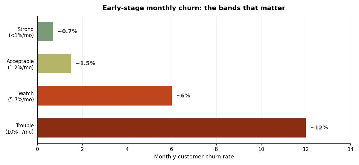
The benchmarks help calibrate, but hold them loosely at low volume. Broadly, a monthly customer churn under 2% is strong for an early B2B SaaS, the commonly cited healthy band sits around 5-7%, and 10%+ is a signal something's wrong with the product or the fit. But here's the honest caveat: at ten or twenty customers, one cancellation can put you at 10% churn for the month. Don't panic at the percentage — read the reason. Early churn is data, not a verdict. The question isn't "is my churn rate good," it's "why did this specific person leave, and is it fixable?"
One more distinction worth tracking even this early: voluntary versus involuntary churn. Voluntary churn is someone choosing to cancel. Involuntary churn is a failed payment — an expired card, a declined charge — and it's often quietly recoverable. If you see churn, split it into those two buckets before you draw any conclusion about your product. Sometimes the "churn problem" is a billing problem in disguise, and the fix lives in your Stripe webhook handling, not your roadmap.
Vanity metrics to keep off the dashboard
The metrics that feel best are usually the least useful in month one. They go up and to the right, they're easy to screenshot, and they almost never change a decision. Keep them off the board.
Here's how I separate signal from vanity for an early-stage SaaS:
| Metric | Track in month one? | Why | | --- | --- | --- | | Activation rate | Yes | Leading indicator of value and retention | | Weekly retention | Yes | The most honest early signal you have | | Net revenue retention | Yes | Shows whether revenue is sticky | | New + churned MRR | Yes (lightly) | Confirms money is moving and where | | Total signups | No | Signups without activation are noise | | Pageviews / unique visitors | No | Traffic isn't value; high traffic, low conversion just hides a fit problem | | Social followers | No | Zero correlation with a working product | | Cumulative revenue | No | Always goes up; tells you nothing about health |
The pattern: cumulative and top-of-funnel numbers feel like progress because they only ever increase. A "total signups" counter never goes down, so it always feels like winning. But signups that don't activate and retain are just a more expensive way to be at zero. The dashboard's job is to show you the truth, not to make you feel good — and vanity metrics are optimized for the second thing.
This connects to how you think about getting your first 100 customers: the goal isn't maximizing raw signups, it's maximizing signups that turn into activated, retained users. A smaller number of the right people beats a big number of the wrong ones, and your dashboard should reflect that priority.
Building the dashboard without overbuilding it
You do not need a data warehouse, a BI tool, or a custom analytics pipeline in month one. You need two sources of truth and maybe an afternoon.
Revenue: Stripe. Your payment processor already knows your MRR, your new and churned revenue, and your failed payments. For the first month, Stripe's own dashboard plus a simple weekly check is enough. If you want the MRR-movement breakdown (new, expansion, contraction, churned) computed for you, a tool like Baremetrics or ChartMogul plugs into Stripe and does it — but that's an optimization, not a requirement. Don't pay for analytics before you have revenue to analyze.
Product behavior: a product analytics tool. To measure activation and retention you need to know what users do, which Stripe can't tell you. This is where a product analytics tool earns its place. I use PostHog because it covers events, funnels, and retention in one free-tier tool, and it drops into a Next.js app cleanly — I wrote the full setup in wiring PostHog into your Next.js SaaS, and there's a copy-paste install prompt in the PostHog marketplace guide if you want your AI assistant to wire it in for you.
Define your activation event explicitly — the one action that means "this user got value" — and build a funnel from signup to that event. Then build a simple weekly retention view. That's it. Two charts: an activation funnel and a retention curve. Plus Stripe's revenue view. Three things total.
Picking the activation event is the part founders overthink, so make it concrete. Ask yourself: what's the smallest action a user can take that proves the product worked for them? For a writing tool it might be "published a first piece." For an analytics product it's "saw their own data in a chart." For Coding Capybaras, it's a successful first deploy. Pick the moment where a reasonable person would say "okay, I get it now," and instrument exactly that. If you're not sure which moment it is, that uncertainty is itself a signal worth chasing down with a few user conversations before you write any tracking code.
One caution on instrumenting: every event you track is a small ongoing maintenance cost, and a dashboard cluttered with events nobody reads is worse than a sparse one, because it buries the two or three numbers that actually drive decisions. Start with the activation event and the cancellation event, confirm they fire correctly, and add new events only when you have a specific question that an existing chart can't answer. Rigor in month one looks like restraint, not coverage.
Resist the urge to instrument everything. Tracking forty events you'll never look at is a form of procrastination that feels like rigor. Track the activation event, the handful of steps leading to it, and the cancellation event. You can always add more once you have a question that needs answering — and at month one, the better source of answers usually isn't an event at all.
The most important metric is a conversation
Here's the thing the dashboard can't do: tell you why. At ten customers, your highest-value "metric" is a direct conversation with a user. The numbers tell you what happened; the person tells you the reason, and the reason is what you act on.
Graham's whole argument in "Do Things That Don't Scale" is that the feedback you get from talking to your earliest users is the best you'll ever get — later you'll wish you could go watch people use your product the way you can when there are only a handful of them. A churn percentage says "someone left." A five-minute email exchange says "I left because onboarding assumed I already knew how to configure X." Only one of those is actionable, and it isn't the percentage.
So I'd put it this way: build the small dashboard, check it weekly, and treat every anomaly as a prompt to go talk to a human. The dashboard surfaces the question. The conversation answers it. That loop — measure, notice, ask, fix — is the entire job in month one. The metrics aren't the point; they're the trigger for the conversations that are.
This also helps with the isolation of solo building: customer conversations are some of the most grounding contact the work offers. Watching numbers alone is lonely and abstract. Talking to the people behind the numbers reconnects you to why you're building at all.
Frequently asked questions
What metrics should a SaaS track in the first month?
Activation rate, weekly retention, and net revenue retention, plus a light read on new and churned MRR. That's the whole list. These answer the only question that matters early — are people getting value and coming back — without drowning you in numbers that need scale to be meaningful.
Is MRR the most important first-month metric?
No. Before product-market fit (roughly sub-$1M ARR), churn and retention matter more than MRR growth. Growth fills the bucket; churn is the hole in the bottom. A fast-growing MRR with high churn is a leaky bucket that just costs more to fill. Watch retention first, growth second.
What's a normal churn rate for a brand-new SaaS?
Loosely: under 2% monthly is strong, 5-7% is a commonly cited healthy band, and 10%+ signals a problem. But at low volume these percentages are noisy — one cancellation among ten customers is 10% churn. Read the reason behind each cancellation rather than reacting to the rate itself.
What tools do I need to build a first-month dashboard?
Two: your payment processor (Stripe) for revenue, and a product analytics tool (PostHog or similar) for activation and retention. Stripe's built-in dashboard plus a free-tier analytics tool covers everything you need in month one. Skip the data warehouse and BI stack until you have a question they're required to answer.
What are vanity metrics and why avoid them?
Vanity metrics are numbers that feel like progress but rarely change a decision — total signups, pageviews, social followers, cumulative revenue. They tend to only ever go up, which makes them feel like winning even when the product isn't working. Keep them off your core dashboard so they don't crowd out activation and retention.
How often should I check my dashboard early on?
Weekly is plenty in month one. Daily checking at low volume mostly produces anxiety and noise, since a single event swings every percentage. A weekly cadence is frequent enough to catch real trends and infrequent enough to keep you focused on building and talking to users rather than refreshing charts.
Build the small dashboard, then go talk to users
A first-month SaaS dashboard should be almost embarrassingly small: an activation funnel, a retention curve, and a glance at revenue movement. Track activation, retention, and net revenue retention; keep signups, pageviews, and follower counts off the board; and remember that early churn percentages are noisy enough that the reason matters more than the rate. Then close the laptop and talk to a customer, because at this stage the most valuable thing on your dashboard is a prompt to go ask a real person why.
If you're building a SaaS with AI coding tools and want the analytics wiring done for you, Coding Capybaras is the free boilerplate I built for exactly this workflow — the marketplace has copy-paste prompts to drop PostHog, Stripe, and the rest of your month-one dashboard into a Next.js app in minutes.